🛠 Modal: Building a Modal

Hey ,

I'm thrilled to help you learn JavaScript. Unfortunately, you've landed on a page where you cannot access with your current purchase.

Please upgrade (use this link) access this content.

I'm super eager to help you learn more!

🛠 Modal: Building a Modal

You’ll learn to build a modal in this lesson. It looks like this:

The modal

Anatomy of a Modal

A modal (also called a dialog) is a component that’s invisible to the eyes at first. This modal lies beneath the main content.

Modal resides below main content when closed.

When you open the modal, you make the modal visible. You also raise the modal above your main content. This allows users to interact with the modal.

Modal rises above main content when visible.

This means the modal should be on a separate <div>.

<div class="container"><!-- Normal content --></div>
<div class="modal-overlay"><!-- Modal content --></div>

Opening and closing the modal

The modal has an overlay that covers the entire screen. You can use the following CSS to build this overlay.

.modal-overlay {
  position: fixed;
  top: 0;
  bottom: 0;
  left: 0;
  right: 0;
}
Modal overlay covers the screen.

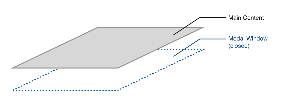
This overlay should be closed at first. We can close it by setting opacity to 0. We also need to move the modal beneath the main content by setting z-index to -1.

.modal-overlay {
  opacity: 0;
  z-index: -1;
}
Modal overlay hidden beneath content.

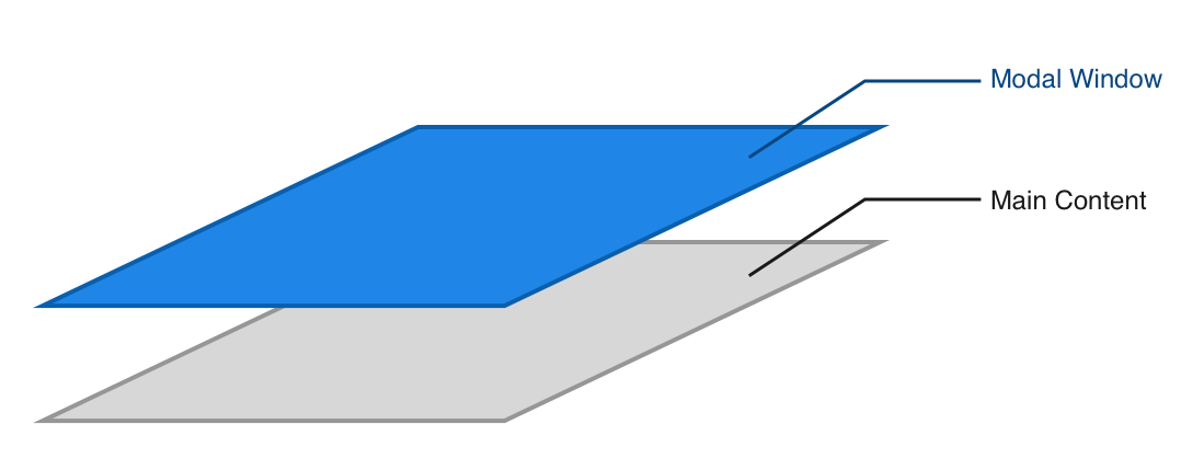
We need a way to tell the CSS when the modal is open. The best way is to add a modal-is-open class to <body>.

<body class="modal-is-open">

We want to make the modal visible when <body> contains .modal-is-open. We can do this by setting opacity back to 1. We also need to raise it above the main content so users can interact with the modal. We do this by setting z-index to 1.

.modal-is-open .modal-overlay {
  opacity: 1;
  z-index: 1;
}
Modal opened.

Opening the modal with JavaScript

When we click the button, we want to open the modal window. This means we should:

  1. Search for the button in JavaScript.
  2. Add an event listener.
  3. When the button is clicked, add .modal-is-open to <body>.
const modalButton = document.querySelector('.jsModalButton')

modalButton.addEventListener('click', event => {
  document.body.classList.add('modal-is-open')
})
Opening the modal.

Closing the modal with JavaScript

Users should be able to close the modal in two ways:

  1. Click the X icon.
  2. Click outside the modal.

To close the modal with the X icon, you need to:

  1. Find the X icon.
  2. Add an event listener.
  3. When the X icon gets clicked, remove .modal-is-open from <body>.
const modalCloseButton = document.querySelector('.jsModalClose')

modalCloseButton.addEventListener('click', event => {
  document.body.classList.remove('modal-is-open')
})
Closing the modal by clicking the X button.

You won’t be able to close the modal by clicking outside the modal yet. You still need to learn more JavaScript to be able to do that. We’ll come back to this later in the Events module.

Exercise

Build the modal without referring to this lesson.