CSS Transitions
Hey ,
I'm thrilled to help you learn JavaScript. Unfortunately, you've landed on a page where you cannot access with your current purchase.
Please upgrade (use this link) access this content.
I'm super eager to help you learn more!
Hey ,
I'm thrilled to help you learn JavaScript. Unfortunately, you've landed on a page where you cannot access with your current purchase.
Please upgrade (use this link) access this content.
I'm super eager to help you learn more!
There are three ways to create animations.
CSS transitions is the simplest one of the three.
A transition occurs when a CSS property changes from one value to another value over a period of time.
You can create transitions with the transition property:
.selector {
  transition: property duration transition-timing-function delay;
}
The transition property is a shorthand of four properties:
transition-propertytransition-durationtransition-timing-functiontransition-delay.selector {
transition-property: property;
transition-duration: duration;
transition-timing-function: timing-function;
transition-delay: delay;
}
transition-property refers to the CSS property you want to transition.
transition-duration refers to the duration of the transition. How long should this transition last? This value is written in seconds with the s suffix (like 3s).
transition-timing-function refers to how the transition occurs. You’ll learn more about this later.
transition-delay refers to the duration to wait before the duration starts. This value is written in seconds with the s suffix.
CSS transitions trigger when:
transition-propertyThat means you can trigger transitions directly through pseudo classes like :hover (activates when mouse goes over an element), :focus (activates when a user tabs onto an element, or when a user clicks into an input element), or :active (activates when user clicks on the element).
/* creating transitions directly in CSS */
.button {
  background-color: #33ae74;
  transition: background-color 0.5s ease-out;
}

.button:hover {
  background-color: #1ce;
}
See the Pen CSS Transition by Zell Liew (@zellwk) on CodePen.
You can also trigger CSS transitions through JavaScript by adding or removing a class (or even changing CSS with the style property).
.button {
  background-color: #33ae74;
  transition: background-color 0.5s ease-out;
}

.button.is-active {
  background-color: #1ce;
}
const button = document.querySelector(".button");
button.addEventListener("click", _ => button.classList.toggle("is-active"));
See the Pen CSS Transition with JavaScript by Zell Liew (@zellwk) on CodePen.
The transition-timing-function governs how a transition occurs. It defaults to ease.
.selector {
  transition: transform 1s ease;
}
The most common timing functions you’ll see are:
Note: There’s also a step timing function. I never found much use for it though. You can read more about it here if you’re interested.
When you set the timing function to linear, your element moves at the same rate over the course of the animation. It doesn’t accelerate or decelerate.
.selector {
  transition-timing-function: linear;
}
Easing is a little easier to explain though a few examples.
Imagine throwing a tennis ball into an open field. When you throw the ball, the ball leaves your hand at its max speed. As it moves, it loses energy, decelerates, and eventually comes to a halt. Right?
This pattern is called ease-out; you start off strong, then decelerates, and finally stops.
.selector {
  transition-timing-function: ease-out;
}
Next, imagine you’re sitting in your favorite car. It’s stationary. The light turns green and you step on the accelerator.
What happens?
Your car inches forward a little, then goes faster and faster until it reaches its top speed. Yeah?
This pattern is called ease-in; you start off slow, then accelerates, and stops suddenly when you reach the end of the animation.
.selector {
  transition-timing-function: ease-in;
}
When you combine ease-in and ease-out, you get ease-in-out—you start off slow, accelerate, hit max speed, decelerate, and stop.
.selector {
  transition-timing-function: ease-in-out;
}
Finally, there’s ease.
ease is weird. Its a faster version of ease-out for some weird reason. I don’t really know how to comment on it. See the difference between ease and other timing functions for yourself in the demo (below).
.selector {
  transition-timing-function: ease;
}
See the Pen CSS Transition Timing Functions (no cubic) by Zell Liew (@zellwk) on CodePen.
Cubic bezier lets you customize your transition timing function through four values. It looks like this:
.selector {
  transition-timing-function: cubic-bezier(x1, y1, x2, y2);
}
Don’t worry about x1, y1,, x2, and y2. They’re values you probably wouldn’t write by hand.
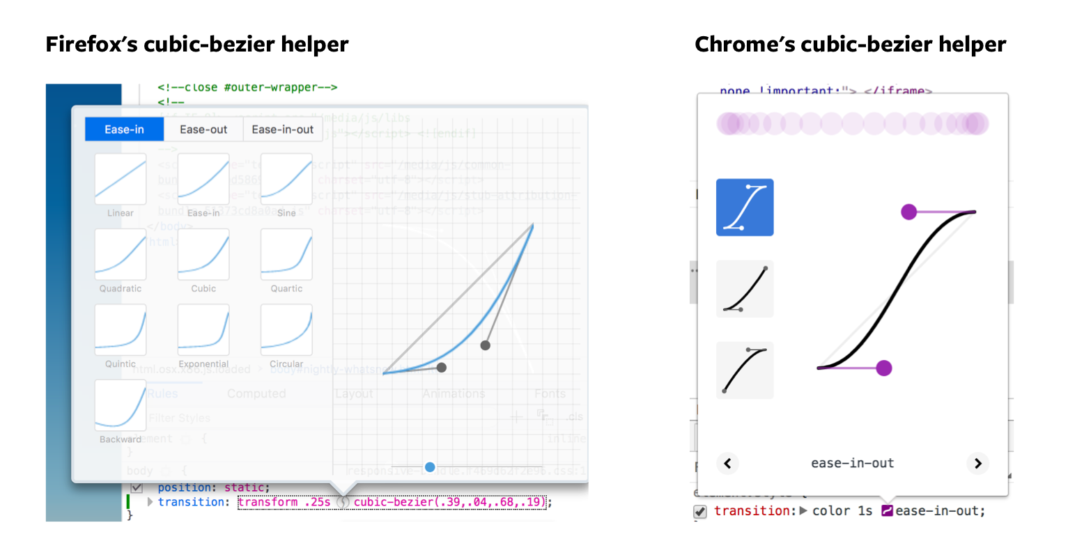
What you’ll do usually, when you use cubic-bezier, is use a helper tool. You can find helper tools everywhere on the internet, including in the devtools!
To open up the cubic-bezier helper in both Firefox’s and Chrome’s devtools, you create a transition-timing-function property for the element you want to transition, then click on the icon that shows up.
See the Pen CSS Transition Timing Functions by Zell Liew (@zellwk) on CodePen.
Note: we won’t get deep into cubic-bezier, as they’re outside the scope of this course. You can learn more about cubic-bezier in this Smashing Magazine article if you’re interested.
To transition two (or more) properties, you need to separate each property with a comma.
If you use the shorthand, you’ll want to specify every property, duration, timing function, and delay. It’s always good to be explicit.
.selector {
  transition:
    background-color 1s ease-out,
    color 1s ease-out;
}
You can do the same with duration, timing-functions and delays as well. If the values are the same, you only need to specify one of them.
.selector {
  transition-property: background-color, color;
  transition-duration: 1s;
  transition-timing-function: ease-out;
}
You may be tempted to transition every CSS property with all. Don’t ever do this. This is bad for performance. Always specify the property you’re trying to transition.
/* DON'T EVER DO THIS */
.selector {
  transition-property: all;
}

/* ALWAYS DO THIS */
.selector {
  transition-property: background-color, color, transform;
}
Create the following transitions:
opacity from 1 to 0 over 1 second when you hover on it.ease, ease-in, ease-out, ease-in-out timing functions.opacity from 1 to 0 over 1 second when you hover on it..element:hover {
opacity: 0;
transition: opacity 1s;
}
ease, ease-in, ease-out, ease-in-out timing functions./* Change ease to other timing functions as necessary */
.element:hover {
opacity: 0;
transition: opacity 1s ease;
}
.element:hover {
  opacity: 0;
  transition: opacity 1s cubic-bezier(0.57,-0.43, 0.27, 1.11);
}