🛠️ Datepicker: HTML and CSS
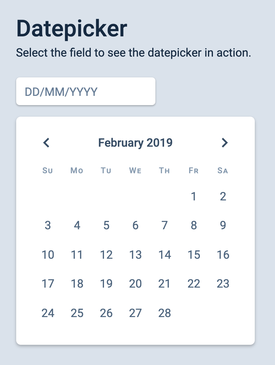
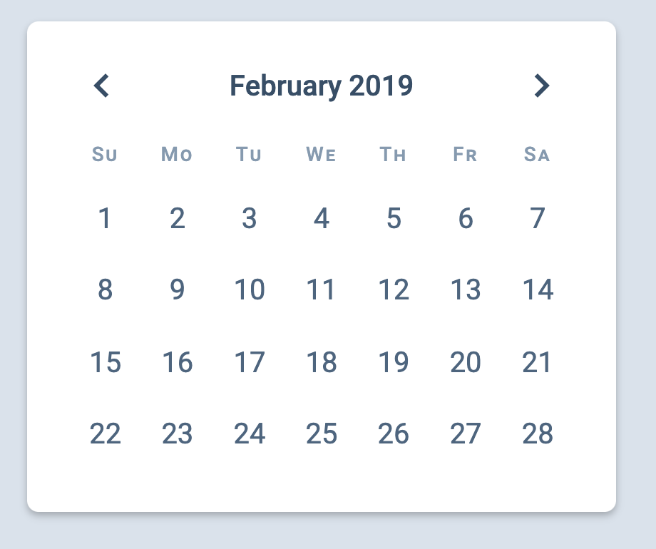
We’re going to build a datepicker together in this series. It looks like this:
Like all the components we built before, we will begin the datepicker by writing the required HTML and CSS.
Building the HTML
There are two parts in a datepicker:
An input
The datepicker itself
The date picker should pop out when a user clicks on the input. (Note: We’ll make the pop-out section last because it’s really annoying to debug something that’s hidden).
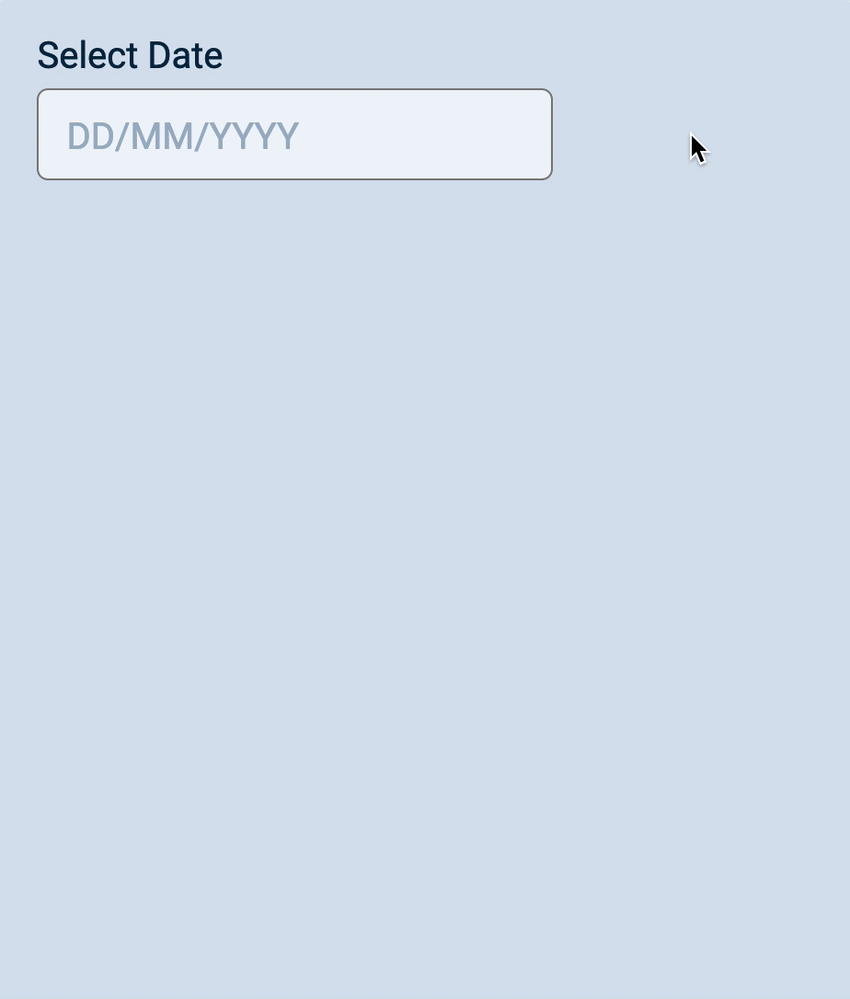
The HTML for this input will be similar to other inputs you’ve seen so far. We’ll omit name because we don’t use it.
<form>
  <div class="input">
    <label for="start-date">Select Date</label>
    <input
      type="text"
      id="start-date"
      placeholder="DD/MM/YYYY"
    />
  </div>
</form>
Note: We put the label and input inside a <div> to make them easier to position and style.
HTML for the Datepicker
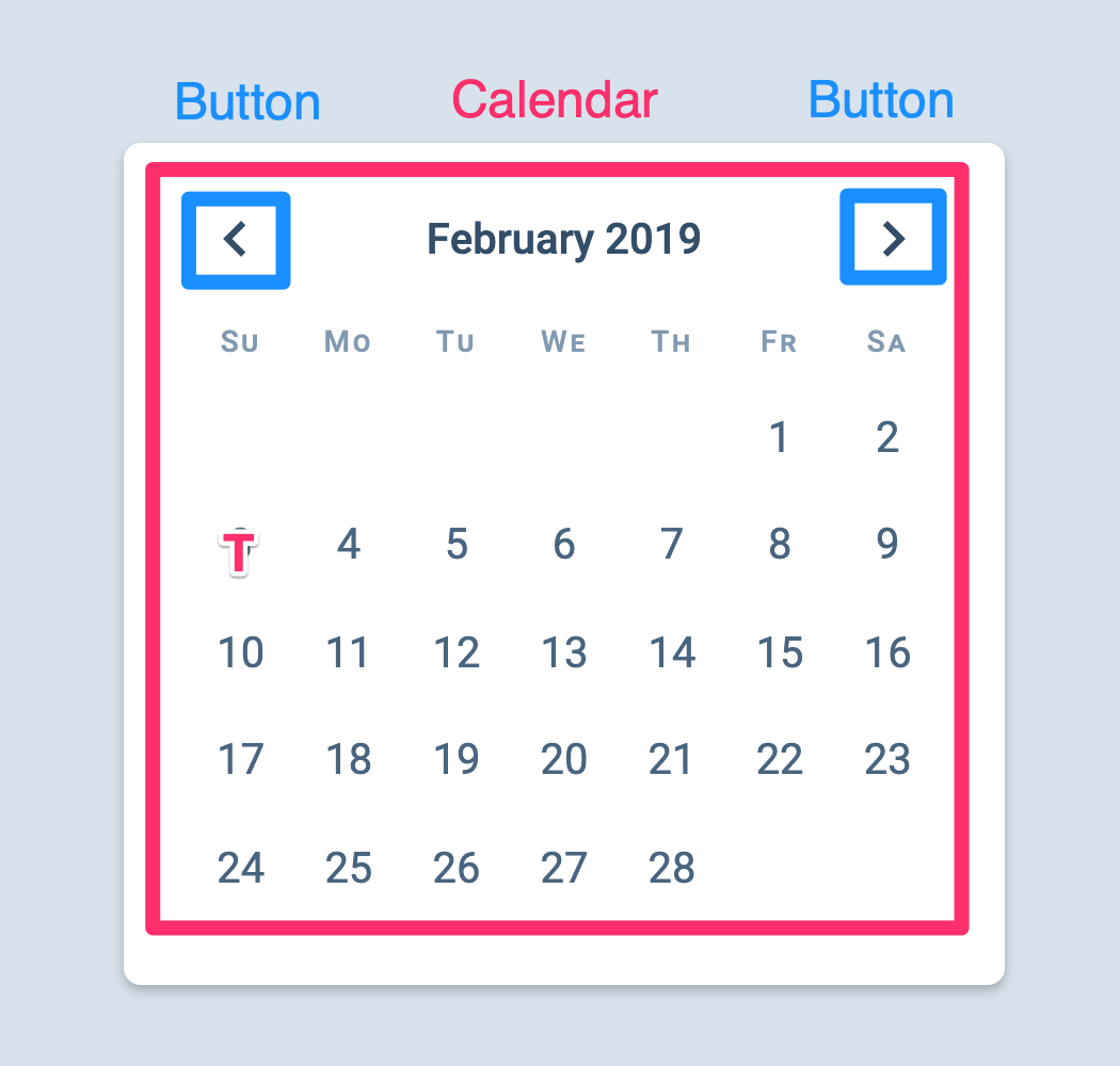
The datepicker itself can be split into a two sections:
The buttons section
The calendar section
A valid HTML structure can be:
<div class="datepicker">
  <div class="datepicker__buttons"><!-- ... --></div>
  <div class="datepicker__calendar"><!-- ... --></div>
</div>
.datepicker__buttons should contain two buttons—one for the previous button and one for the next button. Each button contains an SVG.
<div class="datepicker__buttons">
  <button class="datepicker__previous"> <!-- SVG Icon --> </button>
  <button class="datepicker__next"> <!-- SVG Icon --> </button>
</div>
HTML for the calendar section
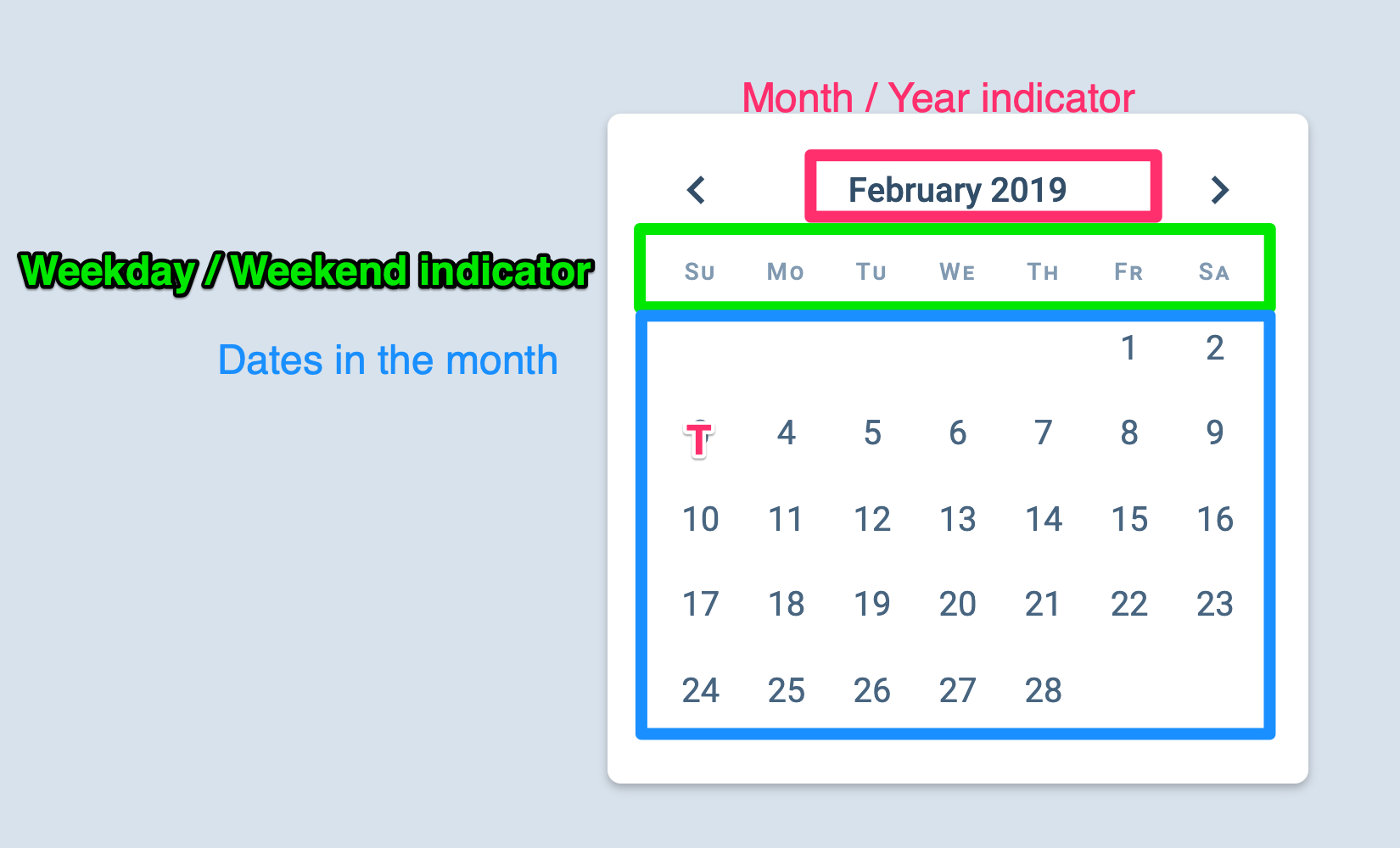
The calendar contains three parts:
The current month/year indicator
The weekday/weekend indicator (that shows the day of the week)
A grid that contains the dates in the month
<div class="datepicker__calendar">
  <div class="datepicker__year-month"> <!-- ... --> </div>
  <div class="datepicker__day-of-week"> <!-- ... --> </div>
  <div class="datepicker__date-grid"> <!-- ... --> </div>
</div>
Year-month indicator
The year-month indicator tells us the year and month currently shown on the datepicker.
Since we’re showing a date-time value, we should use the <time> element. The HTML for the month indicator looks like this:
<div class="datepicker__year-month">
  <time datetime="2019-02">February 2019</time>
</div>
Note: The <time> element’s datetime attribute can be written in many different formats . For this datepicker, we’ll use two of these formats:
year-month (like 2019-02)
year-month-date (like 2019-02-03)
The weekday/weekend indicator
This indicator tells us which day of the week a date is. There should be seven divs since there are seven days in a week.
<div class="datepicker__day-of-week">
  <div>Su</div>
  <div>Mo</div>
  <div>Tu</div>
  <div>We</div>
  <div>Th</div>
  <div>Fr</div>
  <div>Sa</div>
</div>
The date grid
We will build the date grid with CSS Grid for this Datepicker. Here, we can create one <button> for each date in the month. We will also include a <time> element inside each button.
<div class="datepicker__date-grid">
  <button>
    <time datetime="2019-02-01">1</time>
  </button>
  <button>
    <time datetime="2019-02-02">2</time>
  </button>
  <button>
    <time datetime="2019-02-03">3</time>
  </button>
  <!-- ... -->
  <button>
    <time datetime="2019-02-28">28</time>
  </button>
</div>
CSS for the date grid
First, we need to set display property to grid. Since there are seven days in a week, we can create a grid with seven columns.
.datepicker__date-grid {
  display: grid;
  grid-template-columns: repeat(7, 1fr);
}
The weekday/weekend indicator should show the seven days in the week. This means it can share the same CSS Grid as .datepicker__date-grid.
Ideally, we’ll want to use CSS Grid’s subgrid feature here, but that isn’t well supported yet (at the time of writing). So, we’ll create another CSS Grid for .datepicker__day-of-week.
.datepicker__day-of-week,
.datepicker__date-grid {
  display: grid;
  grid-template-columns: repeat(7, 1fr);
}
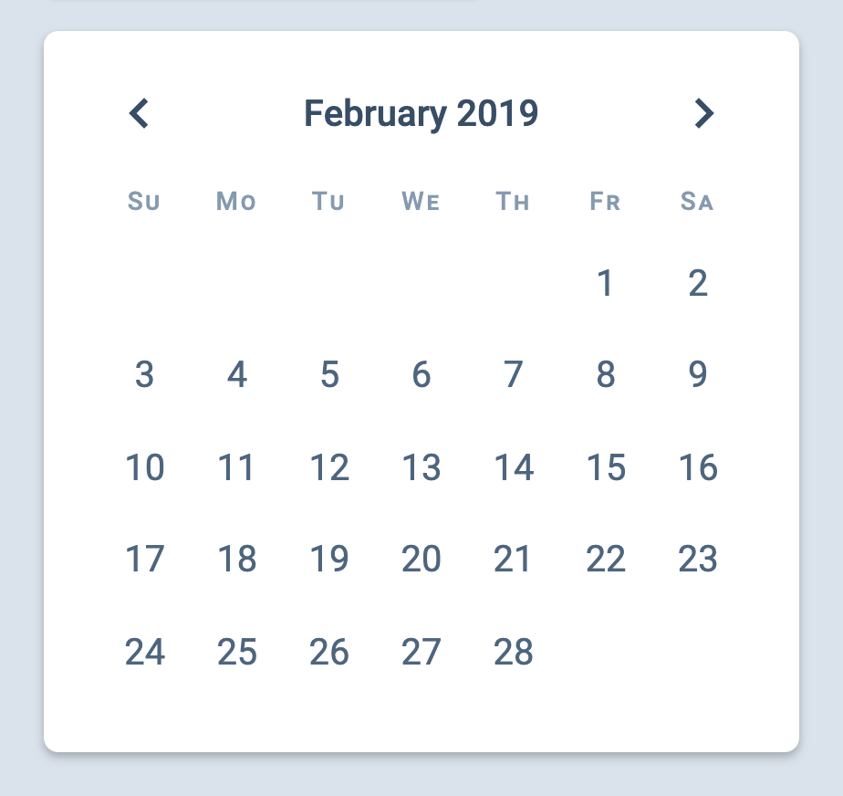
At this point, your grid should look like this:
This works. But we have one problem: 1st February 2019 is a Friday. Not a Sunday.
To fix this, we need to change the position of the first day. We can do so with grid-columns.
If we set grid columns to 2, the CSS Grid will start on Monday
If we set grid-column to 3, CSS Grid starts on Tuesday
If grid-column is 4, 1st day is Wednesday
Since the first day should be Friday, we know that grid-column must be set to 6.
.datepicker__date-grid button:first-child {
  grid-column: 6;
}
That’s it! We’re done with the initial HTML and CSS. And we’ll work on JavaScript next.