đź›  Modal: Animating the pointing hand

Hey ,

I'm thrilled to help you learn JavaScript. Unfortunately, you've landed on a page where you cannot access with your current purchase.

Please upgrade (use this link) access this content.

I'm super eager to help you learn more!

đź›  Modal: Animating the pointing hand

You’ll learn to animate the pointing hand in this lesson.

Animation for the pointing hand.

First, we know the animation begins when the browser loads. Here, we need to use CSS Animation. We can’t use CSS Transition because we don’t have a clear trigger.

Look closely at the pointing hand animation. You can tell three things from the animation.

First, the hand is invisible at the start. It becomes visible later. This means you need to change opacity.

@keyframes point {
  0% {
    opacity: 0;
  }

  100% {
    opacity: 1;
  }
}

.point-hand {
  animation: point 1s ease-out;
}
Pointing hand fades in.

Second, the hand slides in from the bottom. This means you need to move the hand. You can move the hand with translateY.

@keyframes point {
  0% {
    transform: translateY(3em);
    opacity: 0;
  }

  100% {
    transform: translateY(0);
    opacity: 1;
  }
}

.point-hand {
  animation: point 1s ease-out;
}
Pointing hand moves upwards.

Third, the hand moves past its final position before moving back down.

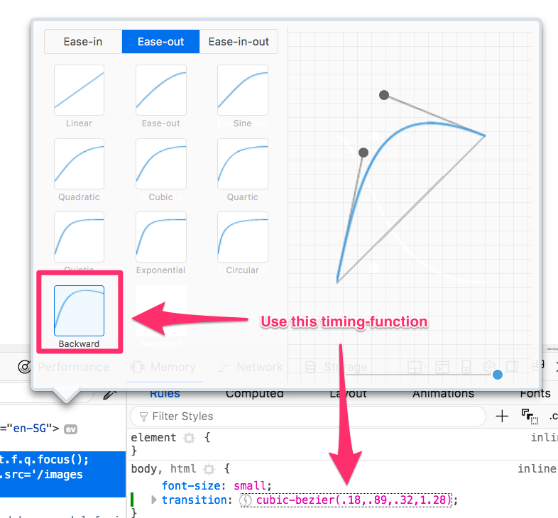
There are many ways to do this animation. One way is to create the movement with @keyframes. (Don’t do this. You’ll kill yourself trying to make the keyframes right). An easier way is to change the timing-function to a “backward” cubic-bezier curve.

Backwards ease-out curve
.point-hand {
  animation: point 1s cubic-bezier(0.18, 0.89, 0.32, 1.28);
}
Animation for pointing hand

That’s it!