You’ll learn to animate the waving hand in this lesson.
Don’t be scared of the animation. It might look complicated, but it’s quite easy once you know what to do.
You need to see there are two parts to the waving hand animation.
The initial zooming part
The actual waving part
CSS Transition or CSS Animation
The wave-hand animation (zoom + wave) is too complicated for a CSS Transition. We need to use a CSS Animation.
The zooming part
Two things happen during the zooming part.
The hand turns opaque (from invisible to visible)
The hand pops out (from small to big)
To make the hand turn opaque, we use opacity. To make the hand zoom up, we use scale.
/* Makes waving hand zoom out */
@keyframes zoom {
  0% {
    transform: scale(0.25);
    opacity: 0;
  }

  100% {
    transform: scale(1);
    opacity: 1;
  }
}
Once you’ve built the zoom animation, add it to the waving hand.
.wave-hand {
  /* This is the backwards cubic-bezier curve */
  animation: zoom 0.5s cubic-bezier(0.18, 0.89, 0.32, 1.28);
}
We want .wave-hand to zoom in only when we open the modal. But at this stage, when we’re building the animation, it helps to see the animation right away.
We will add the modal-is-open class to <body> to help us see the animation.
<body class="modal-is-open"><!-- ... --></body>
The waving part
The waving part feels complicated. When you make anything that feels complicated, you want to focus only on that part.
To focus only on that part, you extract that part and work on it elsewhere. This is called creating a reduced case.
I’ve prepared a CodePen for you to play around with the wave part. Go ahead and click on this link to get started.
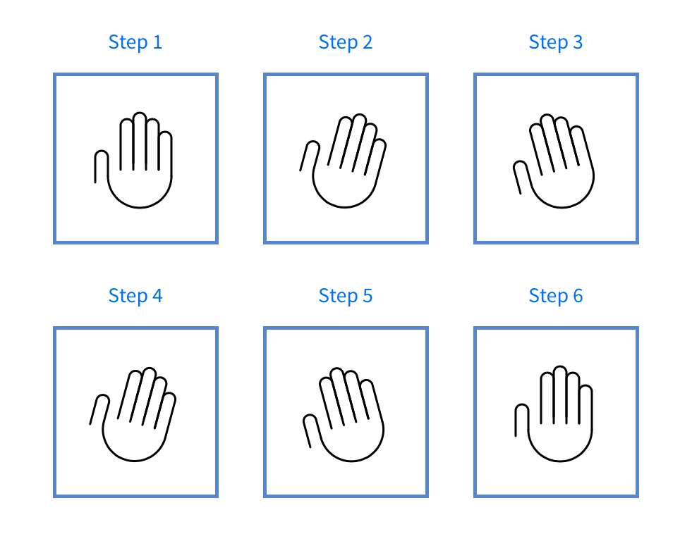
To create wave animation, you need to know where the waving hand moves to. Our hand moves to these six points:
Begins straight upright
Rotates to its left (your right)
Rotates to its right (your left)
Rotates to its left again
Rotates to its right again
Goes back to the starting position
You can say that these 6 points are “snapshots” in the animation. Once you get these six points right, the rest of the animation follows through easily.
Since each snapshot takes up the same amount of time, you can split the @keyframes points evenly into 6 steps (including 0%).
@keyframes wave {
  0% { /* Start at center */ }
  20% { /* Rotate to its left */ }
  40% { /* Rotate to its right */ }
  60% { /* Rotate to its left */ }
  80% { /* Rotate to its right */ }
  100% { /* Back to center */ }
}
For the waving animation, the hand rotates by 15 degrees in each wave. To rotate clockwise, you set rotate to 15 degrees. To rotate anti-clockwise, you set rotate to -15 degrees.
<!-- Remember to add the wave-hand class to your HTML! -->
<svg class="wave-hand" width="112" height="139" viewBox="0 0 112 139"><use xlink:href="images/sprite.svg#wave-hand" /></svg>
The hand waves! But...
Whoa! The animation looks weird. It rotates around the middle of the hand. That’s not how you normally wave!
You want the hand to rotate about the bottom center part so the animation looks natural. To do so, you change transform-origin (which tells CSS where to animate from) to bottom center.
Next, we combine the zoom animation with the wave animation together in the wave-hand selector.
Since zoom comes first, let’s put zoom before wave in the animation property. We’ll add a slight delay to the wave animation to make sure it comes after zoom.
.wave-hand {
  transform-origin: bottom center;
  animation: zoom 0.5s cubic-bezier(0.18, 0.89, 0.32, 1.28),
    /* creates a delay for the wave animation. Experiment with the delay value here! */
    wave 1s 0.55s ease-in-out;
}
Wave hand when opening the modal
We want the hand to wave when we open the modal. To do this, add the animation only when modal-is-open is present on <body>.
(Remember to remove modal-is-open from your HTML).