🛠️ Popover: Making one popover

Hey ,

I'm thrilled to help you learn JavaScript. Unfortunately, you've landed on a page where you cannot access with your current purchase.

Please upgrade (use this link) access this content.

I'm super eager to help you learn more!

🛠️ Popover: Making one popover

Popovers are contain extra information. They pop out when a user clicks on a button that triggers it.

Most popovers appear in four directions:

  1. Top
  2. Right
  3. Bottom
  4. Left

It helps to learn to create popovers that appear in all four directions. For this lesson, you’ll learn to build a popover that appears at the top.

Image of a popover.

Making a trigger

A popover requires a trigger. The trigger should be a <button> element since we want users to interact with it.

<button class="popover-trigger"> ... </button>

For this component, we’ll use arrows as triggers. We’ll create these arrows with SVG.

<button class="trigger">
  <svg viewBox="0 0 40 20">
    <use xlink:href="#arrow"></use>
  </svg>
</button>

Building the popover

Popovers should appear above all other elements. This means popovers must be a direct descendant of the <body> element. If popovers are placed inside another element, they may get cut off when an ancestor element uses transform or overflow.

<body>
  <!-- other elements -->
  <div class="popover">
    <p>The quick brown fox jumps over the lazy dog</p>
  </div>
</body>

The popover needs to know the direction they should appear. We can use a custom attribute for this. Let’s call this custom attribute data-position.

<div class="popover" data-position="top">
  <p>The quick brown fox jumps over the lazy dog</p>
</div>

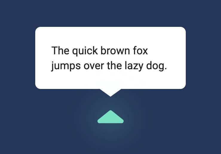
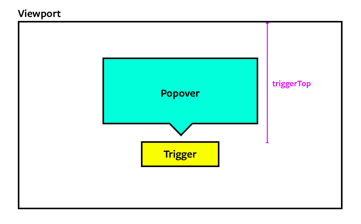
The top popover should appear above the top trigger as shown in the picture below.

Top popover should appear above trigger

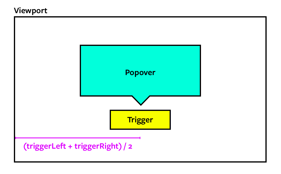
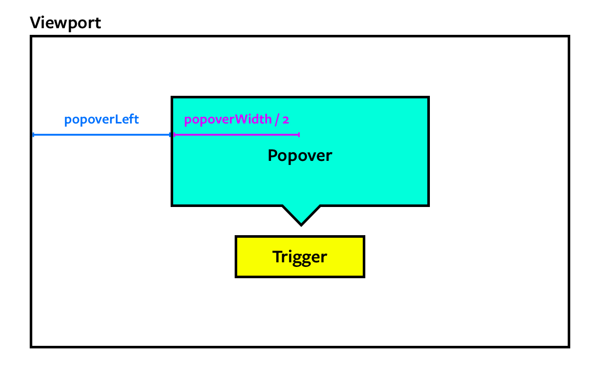
We can only achieve such a precise positioning by setting position to absolute. Since position is absolute, we need to provide the correct top and left values.

.popover {
  position: absolute;
  /* Example values */
  top: 300px;
  left: 500px;
}

This means we need to use JavaScript to calculate the top and left values.

Calculating popover’s left position

First, we need to get the trigger and popover.

const popoverTrigger = document.querySelector('.popover-trigger')
const popover = document.querySelector(`.popover`)

To position the popover above the trigger, we also need to know the center position of the trigger.

Getting the center of the trigger

We can get these values with getBoundingClientRect.

const popoverTriggerRect = popoverTrigger.getBoundingClientRect()
const triggerCenter = (popoverTriggerRect.left + popoverTriggerRect.right) / 2

The center of the trigger is also the center of the popover. We can calculate the popover’s left position with this information.

Calculating the popover's left value

We’ll need the popover’s width value to calculate the left position. We can find the popover’s width value with getBoundingClientRect.

const popoverRect = popover.getBoundingClientRect()
const leftPosition = triggerCenter - popoverRect.width / 2

We can set the left position with the style property.

popover.style.left = `${leftPosition}px`
Set the popover's left position.

Next, we want to find the top position.

Calculating popover’s top position

To calculate the popover’s top position, we first need to find the trigger’s top position.

Getting the trigger's top value

We can get this value from getBoundingClientRect.

const triggerTop = popoverTriggerRect.top

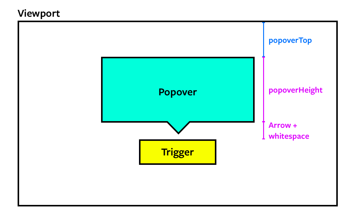
The trigger’s top value is equal to the sum of the popover’s top value, the popover’s height, and some breathing space.

Calculating the popover's top value

Let’s say the space is 20px.

const space = 20

We can get the popover’s height from popoverRect.

const topPosition = triggerTop - popoverRect.height - space

We will then set the top position with the style property.

popover.style.top = `${topPosition}px`
Set the popover's left and top position.

Hiding the popover

The popover should be hidden at first. We can hide the popover by adding the hidden attribute. Make sure you add this hidden attribute after positioning the popover.

popover.style.left = `${leftPosition}px`
popover.style.top = `${topPosition}px`

// Hiding the popover
popover.setAttribute('hidden', true)

Showing and hiding the popover

We need to show the popover when the trigger gets clicked. To do this, we remove the hidden attribute.

popoverTrigger.addEventListener('click', _ => {
  popover.removeAttribute('hidden')
})

If the user clicks the trigger again, we want to hide the popover. We can use an if statement to accomplish this.

popoverTrigger.addEventListener('click', _ => {
  if (popover.hasAttribute('hidden')) {
    popover.removeAttribute('hidden')
  } else {
    popover.setAttribute('hidden', true)
  }
})
Shows and hides popover when trigger gets clicked.

If the user clicks outside the popover and the trigger, we want to hide the popover as well. We can do this by listening to the document.

document.addEventListener('click', event => {
  // ...
})

If event.target does not originate from within .popover or .popover-trigger, we know the user has clicked outside both the popover trigger and the popover.

We’ll hide the popover by setting hidden to true.

document.addEventListener('click', event => {
  if (event.target.closest('.popover') || event.target.closest('.popover-trigger')) return
  popover.setAttribute('hidden', true)
})
Hides popover when clicking outside of the popover.

That’s it!