🛠️ Todolist: The HTML and CSS

Hey ,

I'm thrilled to help you learn JavaScript. Unfortunately, you've landed on a page where you cannot access with your current purchase.

Please upgrade (use this link) access this content.

I'm super eager to help you learn more!

🛠️ Todolist: The HTML and CSS

We’re going to build a simple Todolist together. You’ll be able to:

  1. Add a task
  2. Complete a task
  3. Delete a task

Here’s what it looks like:

Image of a Todolist. The Todolist contains three tasks in it

The structure

The Todolist can be split into two parts:

  1. The new task part
  2. A list of todos
Todolist contains two parts—the new task part and the taskList

Whenever we want to get information from users, we want to use a <form> element. This is how we’ll start the Todolist.

<form action="#" class="todolist" autocomplete="off">
  <!-- Add new task -->
  <!-- List of todos -->
</form>

Note: We set autocomplete to off because we don’t want browsers to trigger their autocomplete window.

HTML for adding tasks

First, we’ll use a <div> to wrap the new task part.

<form action="#" class="todolist" autocomplete="off">
  <div class="todolist__new-task"> ... </div>
  <!-- List of todos -->
</form>

From the design, you can see we need three things in the part for adding a new task:

  1. A label
  2. A text input field
  3. A submit button

To make the design easier to code, I wrapped the label and input in one <div>. Here’s the HTML for the new task part:

<div class="todolist__new-task">
  <div class="new-task__input-group">
    <label for="new-task">Add a task</label>
    <input
      type="text"
      id="new-task"
      name="new-task"
      placeholder="E.g. Buy groceries"
    />
  </div>
  <button type="submit">
    <svg viewBox="0 0 10 10">
      <path d="M6 4h4v2H6v4H4V6H0V4h4V0h2z" fill-rule="nonzero">
    </svg>
    <span>Add task</span>
  </button>
</div>
The new task part

HTML for the list of todos

The Todolist contains a list of Todos. We’ll call each Todo item a “task” because “task” is easier to say and write compared to “todo item”.

We’ll create the list of tasks with an unordered list.

<form action="#" class="todolist" autocomplete="off">
  <div class="todolist__new-task"> ... </div>
  <ul class="todolist__tasks">
    <li class="task"> ... </li>
    <li class="task"> ... </li>
    <li class="task"> ... </li>
  </ul>
</form>

HTML for each task

Each task contains three things:

  1. A checkbox
  2. The task name
  3. A delete button
Task contains three things: A checkbox, the task, and a delete button

We’ll make the task name and the delete button first because they’re easy:

<li class="task">
  <span class="task__name">Drink water</span>
  <button type="button" class="task__delete-button">
    <svg viewBox="0 0 20 20">
      <path d="M10 8.586L2.929 1.515 1.515 2.929 8.586 10l-7.071 7.071 1.414 1.414L10 11.414l7.071 7.071 1.414-1.414L11.414 10l7.071-7.071-1.414-1.414L10 8.586z"/>
    </svg>
  </button>
</li>

You should have this now:

Displays a task with the task name and a delete button with the shape of an X

Making the checkbox

We can make a checkbox with an input element. Here, we set type to checkbox.

<li class="task">
  <input type="checkbox" id="task">
  <span class="task__name">Drink water</span>
  <button type="button" class="task__delete-button"> ... </button>
</li>
Task has a checkbox, task name, and delete button. Checkbox has the default style by the browser.

When the checkbox is checked, we want to strike out the task. This marks the task as “complete”.

We need to know two CSS things to do this:

  1. The :checked pseudo-class
  2. The adjacent sibling combinator

The :checked pseudo-class tells us whether a checkbox is checked.

input[type="checkbox"] {
  /* Not checked */
}

input[type="checkbox"]:checked {
  /* Checked */
}

The adjacent sibling combinator (+) allows us to style a second element if it follows the first element.

/* This will style <h2> only if HTML looks like this:
 * <h1> ... </h1>
 * <h2> ... </h2>
 */
h1 + h2 {
  color: red;
}

We can use :checked and + to style strikeout a task.

input[type="checkbox"]:checked + .task__name {
  text-decoration: line-through;
}
When a user clicks the checkbox, the task has gets struck out.

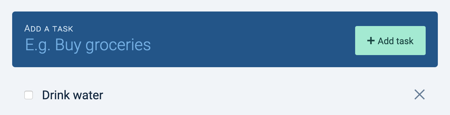
Next, we want to style the checkbox to fit our design.

Unfortunately, browsers make it hard for us to style <input> elements. We will create a <label> element after the <input>, and we’ll style the <label> instead.

<li class="task">
  <input type="checkbox" id="task">
  <label for="task">
    <svg viewBox="0 0 20 15">
      <path d="M0 8l2-2 5 5L18 0l2 2L7 15z" fill-rule="nonzero" />
    </svg>
  </label>
  <span class="task__name">Drink water</span>
  <button type="button" class="task__delete-button"> ... </button>
</li>

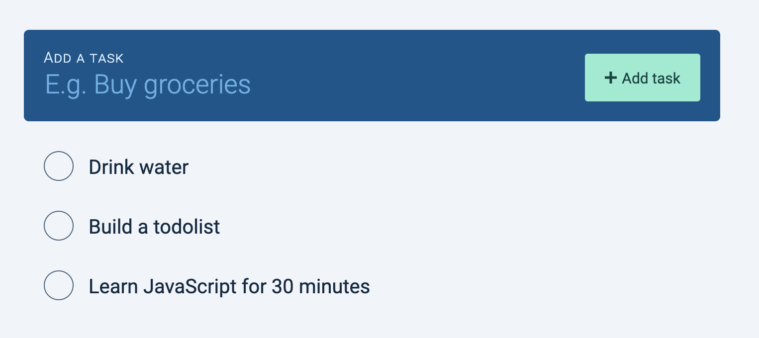
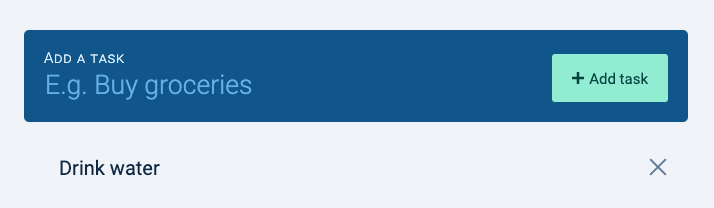
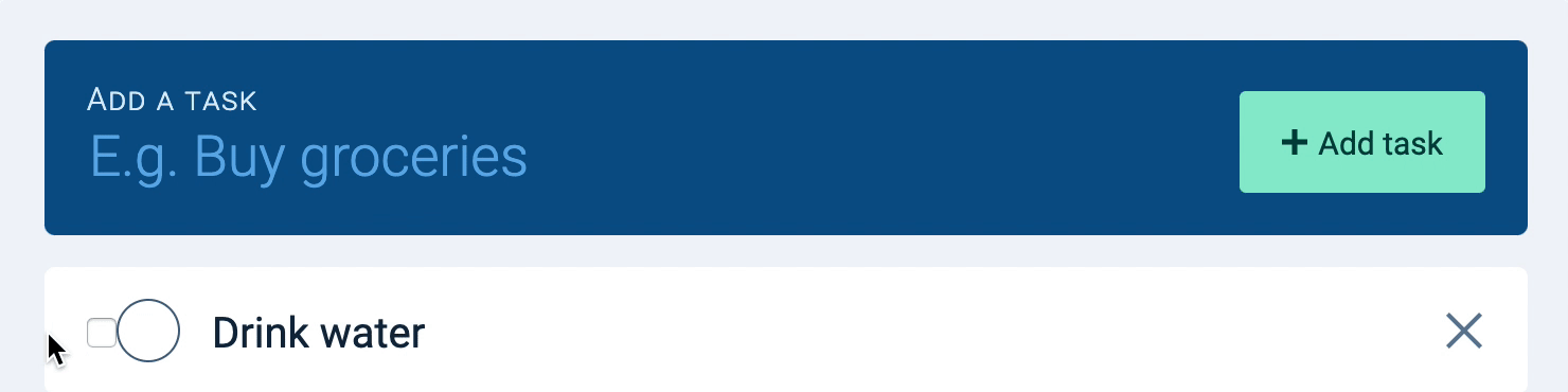
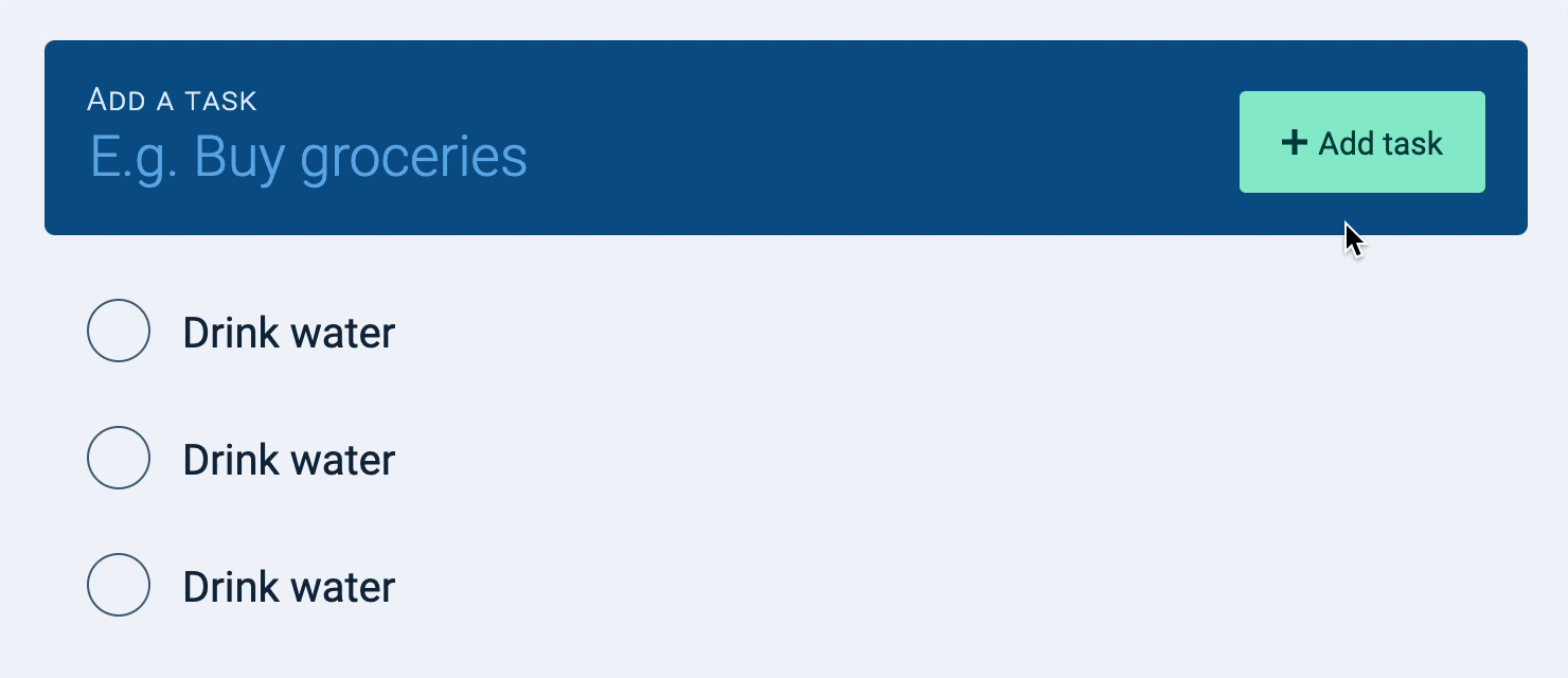
I went ahead and styled the label according to the design, so this is what you should see at this point:

There's a circle to the right of the checkbox. This circle is styled according to the design

When the checkbox is checked, we want to use style the label so it is checked. We can use the same :checked and + trick we used earlier to create this effect.

/* Note: This is already styled for you in the Starter CSS file */
input[type="checkbox"]:checked + label {
  /* Check the label */
}

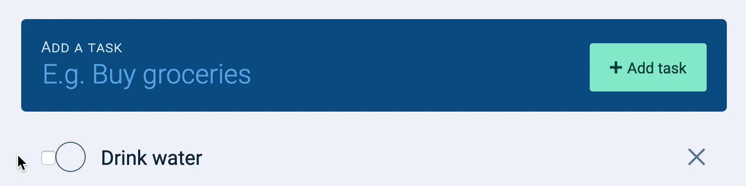
You should get this effect:

  1. When you check the checkbox, the label should get checked.
  2. When you uncheck the checkbox, the label should get unchecked.
  3. When you check the label, the checkbox should get checked.
  4. When you uncheck the label, the checkbox should get unchecked.
When user checks the checkbox, label gets checked as well.

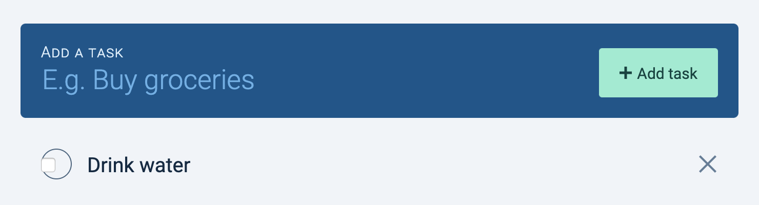
Notice the strikeout style didn’t apply to .task__name anymore? This happens because we added <label> between our checkbox and .task__name. The :checked and + trick doesn’t work anymore.

To fix the strikeout style, we can use the general-sibling combinator (~). ~ works like +, but it applies to any sibling that comes after the first selector.

Here’s the fix:

input[type="checkbox"]:checked ~ .task__name {
  text-decoration: line-through;
}

And it should work again.

When checkbox gets checked, strikeout text applies to task name

Next, we want to hide the checkbox visually. There are two steps to do this.

First, we take the checkbox out of the document flow with position: absolute. This means the checkbox doesn’t take up any space.

.task input[type="checkbox"] {
  position: absolute;
}
Checkbox and label ovelaps

Second, we hide the checkbox with opacity: 0. This makes the checkbox invisible to the eyes.

.task input[type="checkbox"] {
  position: absolute;
  opacity: 0;
}
Task created!

Making a second task

You can copy/paste the HTML of the first task to make the second task.

Make sure you change the id attribute (on the checkbox) and for attribute (on the label) so the checkbox syncs its corresponding label.

<ul>
  <li class="task">
    <input type="checkbox" id="task-1">
    <label for="task-1"> ...  </label>
    <!-- ... -->
  </li>

  <li class="task">
    <input type="checkbox" id="task-2">
    <label for="task-2"> ...  </label>
    <!-- ... -->
  </li>
<ul>
Three tasks in the taskList

The delete button

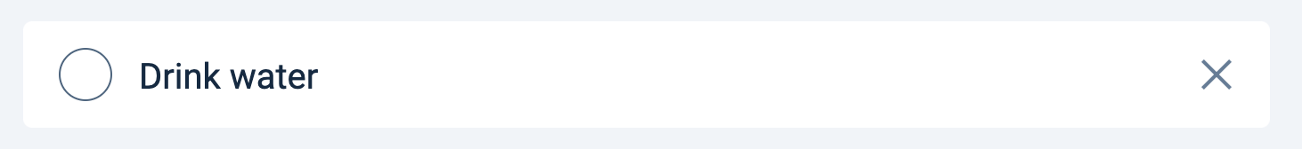
We want to hide the button to delete a task at first. This reduces things we place on the UI (and hence reduces cognitive load).

We only want to show the delete button when a user hovers over the task. We can change its opacity to do this.

.task__delete-button {
  opacity: 0;
}

/* This one is done for you */
.task:hover .task__delete-button {
  opacity: 1;
}
The delete button shows up when a user hovers over a task

Now there’s one thing left to do.

Making the empty state

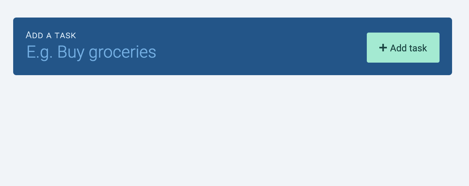
What happens when there are no tasks? Try deleting the tasks you created. This is what you’ll see.

Task component only contains the add task part

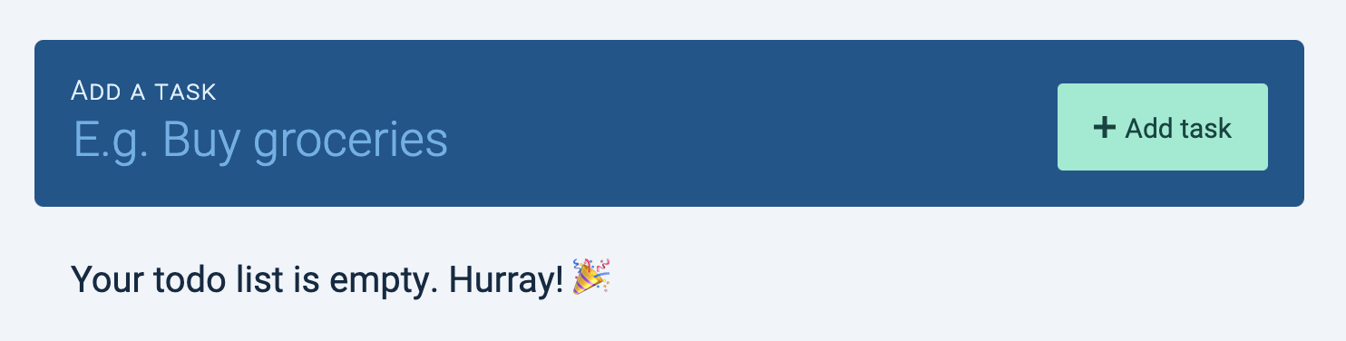
A user who stumbles onto this empty Todolist may not know they can create tasks with the new task form. We can make it clearer to them with some text that says the Todolist is empty.

The words 'Your todo list is empty. Hurray! 🎉' shows up in place of the taskList

To build this empty state, we add an extra <div> after .tasks.

<form action="#" class="todolist" autocomplete="off">
  <div class="todolist__new-task"> ... </div>
  <ul class="todolist__tasks"> ... </ul>
  <div class="todolist__empty-state">Your todo list is empty. Hurray! 🎉</div>
</form>

We want to display .todolist__empty-state only when there are no tasks in .tasks. We can do this with the :empty pseudo-class.

.tasks + div {
  display: none;
}

.tasks:empty + div {
  display: block;
}

Note: :empty only works if the .tasks is really empty. This means the <ul> element cannot contain any whitespaces, like this:

<ul class="todo"></ul>
<div>
  <p>Your task list is empty. Hurray! 🎉</p>
</div>

Try removing the whitespaces manually from the HTML. You should be able to get this to work.

The words 'Your todo list is empty. Hurray! 🎉' shows up in place of the taskList

That’s it for the HTML and CSS!